“BUILD A GIANT TERRARIUM WITH HOLES ONLU BIG ENOUGH FOR BEES. FILL IT WITH PLANTS NATIVE TO NEW YORK SO IT BECOMES A TINY SLICE OF WHAT BROOKLYN WAS BEFORE PEOPLE LIVED HERE”
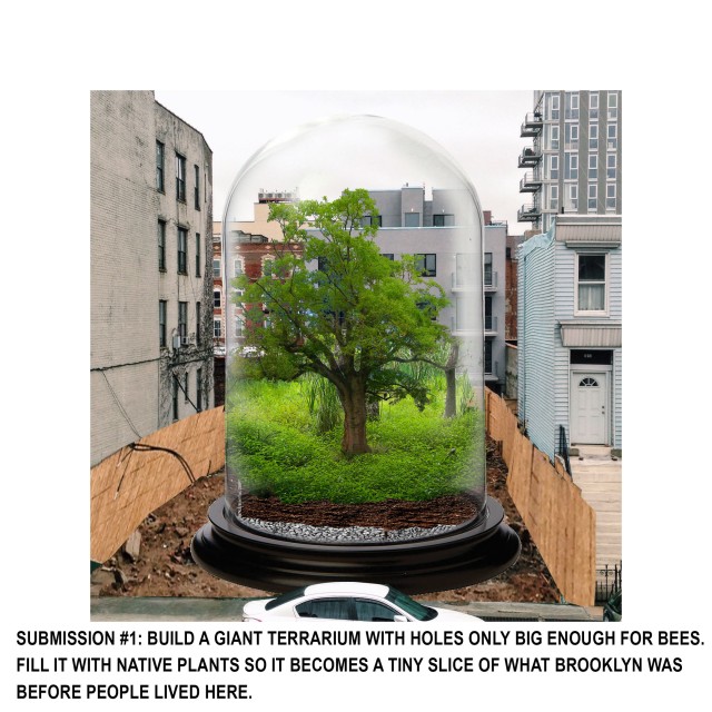
“BUILD A GIANT TERRARIUM WITH HOLES ONLU BIG ENOUGH FOR BEES. FILL IT WITH PLANTS NATIVE TO NEW YORK SO IT BECOMES A TINY SLICE OF WHAT BROOKLYN WAS BEFORE PEOPLE LIVED HERE”
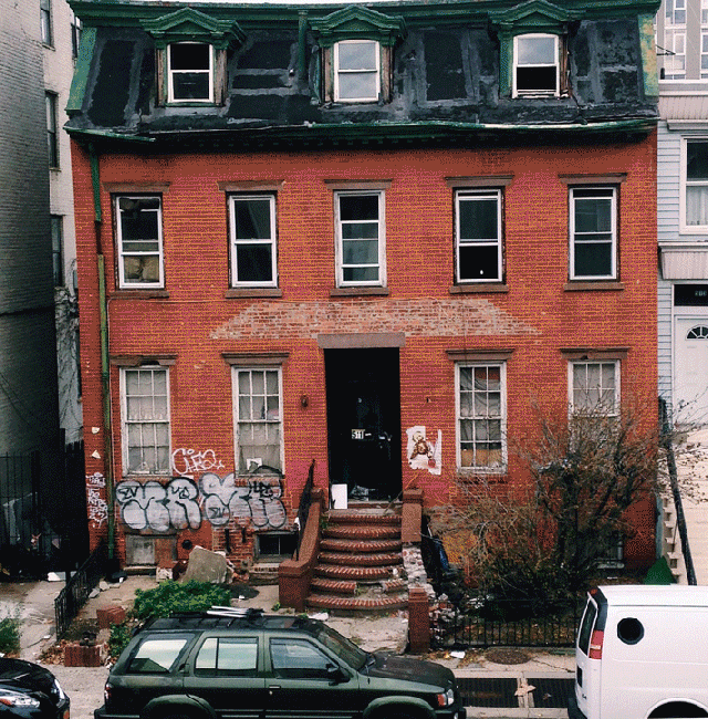
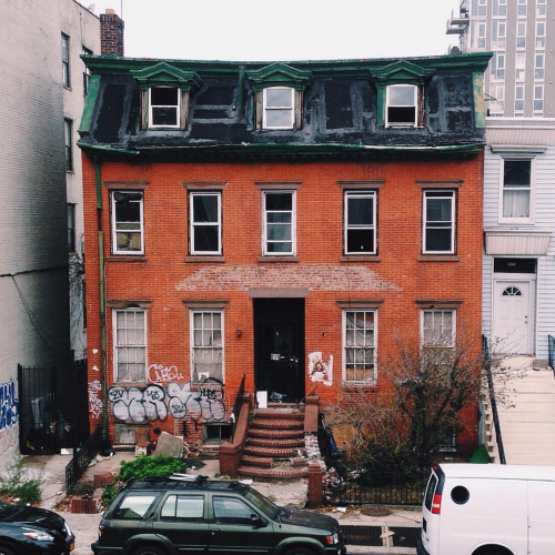
Meet 511 Lafayette Avenue. Also known as Brooklyn Block 1783, lot 93.
It’s the building across the street from my apartment. Also known as a small scale personal obsession since I moved in 3 years ago. It’s a double-wide red brick structure with a mansard roof and dormer windows. Pretty unusual for this part of Brooklyn.
My little photo project started as a private thing – This building dominates the view from the front of my apartment, and the longer I lived here the more I noticed how much time I spent staring at it figuring out what had changed from day to day.
So, I started taking photos and posting them to this tumblr whenever I noticed a change. Then, I created an instagram and took the same photo every day, posting it as a kind of super-slow time lapse.
In the “about” section of the tumblr, I describe watching a decaying building as a “metric for the passage of time”. Because I’m kind of a jerk.
I think what I meant, what I mean, is that in a city where things move extremely quickly, and where I felt kind of out of control of my own future, this slowly decaying architecture helped me stay grounded. Became a routine to help me keep track. It was kind of meditative. Like watching a forest grow.
I started researching the history of 511. Talking to people on the block about what they knew about it.
Breaking in and photographing the interior never appealed to me in the same way. There’s a whole community built around that – Urban Spelunking, the documentation of abandoned spaces. But for me, this long term timelapse has always been about distance, observation, voyeurism. I liked the idea of building a timelapse file that theoretically would take years to complete. I considered making the world’s most boring desk calendar.
A few days before Christmas of this year, a demolition crew showed up. By the time I came back from the holiday all of the windows were gone, and today the building is a shell: no interior walls, no flooring. A dumpster comes every morning and is full by noon.
So now, at the beginning of a new year, I feel compelled to share a little bit about this thing that is being lost.

According to city records, 511 Lafayette Avenue was built in 1915. The first digitized record I have for it is an occupancy certificate from 1940. Then nothing until a mortgage dated 1964.
The ownership history of 511 follows a lot of the patterns of the neighborhood. The family that bought it in the early 60s lived there until the 80s. The building was bought in the mid 90s by a small-scale landlord, shadily mortgaged in 2008, falling into disrepair by 2010. In 2014 it was foreclosed on, re-mortgaged by a large real estate group, and then slated for full demolition in 2015. Those are the facts.
The details are more curious and I’m not going to go into all of them now, because I am still fact finding. But here is a sampling:
The building is lived in by the family that bought it in the 60s until the mid 80s. It is split into 2 apartments, one on the ground floor, and one on the second floor and the attic.
Here’s a photo of it from the Brooklyn Building Census of 1980:

IN 1985, a murder (the guys on the block say drug-related, the New York Times says burglary) happens. The owner, her son, and possibly a tenant are killed.
After some passing around of the deed, 511 goes to a man named Kamau Kambon – an activist and intellectual. Kambon had some kind of relationship with the owner: I think together they ran something called the “Institute of Life Synthesis”.
Kambon will become semi famous in 2005 after giving a speech calling for the extermination of all white people. In that speech he also mentions having taken a decision to live completely off the grid (he built his own cabin with his wife in North Carolina). I’m finding out more about him.
But he remains basically the owner (there are some fun blips I’m skipping here), until 1996, when the building is sold to a family that seem to be some kind of small-time landlords. The mortgage is filed as $95,000.
By 2008, this owner takes out a second mortgage with something called “The Mendel Group” (note: not a bank), on 5 properties in and around Bedford Stuyvesant. Its for $1.3 million.
Meanwhile, in 2007, city violations start coming in. I won’t go into all of them, but the biggest one is for creating an illegal 3rd apartment in the cellar. The violations get bigger and bigger (reaching $24k for a single fine of failing to comply in 2010).
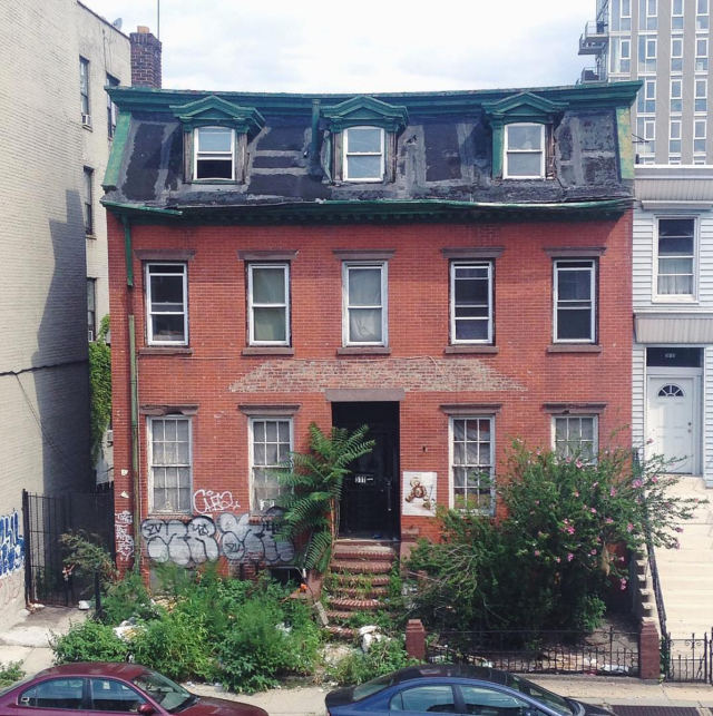
But by 2010, the building is abandoned. The first order to seal the vacant building is dated 6.27.2009.
On 3.26.14, the city files the following complaint: “Vacant bldg. for 2 years open front door, windows & fence down; occup by squatters”.
On 4.25.14 the property is foreclosed on. Bought out by a company called “Flushing Ave Plaza” (formerly the “Mendel Group”).
This is what the building looked like on that day.

On September 24, 2015, Flushing Ave Plaza took out a $2.2mil mortgage on 511 and a second property on Skillman. Presumably to renovate them.
This is what the building looked like on that day.

On Nov 19, 2015, the Flushing Ave group submitted a demolition notice with the city.
This is what the building looked like on that day.

This is what the building looks like today. Right now.

Look, I’m not super sentimental about this stuff. The entire history of New York City is a tearing down of the old to replace it with newer, more profitable things. A land of opportunity. Its not particularly romantic, but in my opinion it is part of the culture of the city – inextricable from living here.
But the story of this one building, in this spot, in this neighborhood, is completely fascinating to me. The more I learn about it the more I understand how real-estate (essentially the life-blood of this city) moves. And I am going to keep learning.
Watch this space. I imagine in the next year we will see the shell of 511 come down and presumably something pretty tasteless go up in its place. We will see who ends up living there. For the first time in almost 10 years that lot will be occupied.
The more I learn about it, the more I understand that 511 encompasses exactly what is happening and has happened to Brooklyn in the last century. It started as a personal project about the passage of time on a small scale – seasons, objects moving around, private mysteries. But now its feels more like bearing witness to the changing neighborhood. Its becoming a kind of Quixotic mission of mine to capture every last moment that this building has. To find every tidbit of information I can.
So, this new year, I’m pouring one out for 511 Lafayette Avenue. And also saying a toast for the discoveries to be made in the coming year.
In case anyone still reads this. I’m about to start posting things NOT about making props. Its been a few years. Life has changed. I’m sorry.
Its been a while since I’ve made a prop. Lets be specific: It’s been a while since I’ve developed a prop. Which is a very different process. Making props happens all the time. Whenever you hand an actor a piece of paper to be a letter, or an umbrella or a hat or whatever, you made a prop.
Developing a prop involves thinking about what the thing is used for and why, and then through a process of trial and error, coming up with a thing that will do the one very specific job the prop has to do onstage. Unlike real things, props are often not what they seem, and built incredibly specifically for one purpose.
Which is to say that I recently developed a pie for a production of Titus Andronicus. If you don’t know the play, you should. It is a dark and difficult story about the disintegration of a man, his family, and his country. Unlike most Shakespeare plays, Titus is almost completely in verse, meaning that the rhythm of the thing drives inexorably forward to its conclusion.
A quick summary of the relevant parts of the plot: Titus comes home from war and a revenge cycle is very quickly instigated when he kills the firstborn son of Tamora, queen of Goths. She, through various machinations, becomes Empress of Rome and sets her sons, Chiron and Demetrius, to avenge the death of her first-born. Ultimately they rape Titus’ daughter Lavinia and cut off of her hands and tongue so that she cannot reveal their identities. At the end of the play, Titus has discovered who was responsible for the rape, murdered Chiron and Demetrius, and baked them into a pie which he has fed to their mother. Then everyone at the table kills everyone else at the table.
In short, a heartwarming romp into Roman history.

The set for this production was super raw. I wanted it to feel bleak and neutral so that the elements that really told the story popped. Essentially, it was a raised platform that connected with the gallery of the theater. Both the platform and the gallery had white ceilings with fluorescent lights added, and we built a goalpost upstage with strip lights to create trees in the forest scenes.
There are 14 deaths/wounds/dismemberments in Titus, but in order to highlight the sense of disgust at Titus’ pie-revenge story (it comes pretty late in the play), we chose not use blood until he kills Chiron and Demetrius.

The blood rig is another story, but all of this is to say THE PIE WAS REALLY IMPORTANT. I wanted the whole audience to feel like it really was made of dead people. It should be deeply uncomfortable to watch them eat the pie in the final scene — all of a sudden, the story should become real, physical, relatable. For me, the design was about the real-ness and texture of the blood when we finally see it, and the pie, juxtaposed with the cold, unforgiving set.
So, I basically wanted a giant medieval meat pie that was stiff enough to cut into slices.
Like these!

 yum.
yum.
What I learned about these concoctions (actually, the top one is a prop, and not edible, but thats totally what I wanted mine to look like) is that traditionally, the meat pie is a crust made in a huge heavy dish, baked first, then the meat is added on top, and a lid is put on. They were actually more like a medieval “bread bowl” — at large feasts they were brought out with a course in them, then taken back to the kitchen and refilled with the following course.
In fact, they were sometimes used jokingly where the pie would be brought out, the lid lifted, and live birds released… then it would be taken back and refilled with food. Just imagine what a scared bird would do incise a pie crust. Ew.
Anyways, I was into it, except I wanted mine to slice, so the inside needed to be pretty stiff. And we also would need a new one for each performance, so it would have to be cheap to make. Eventually, I was budgeted at $10 per pie.
Oh, and did I mention that the pies had to be gluten and lactose free? You know, to make it more of a challenge.
So heres what I ended up doing:
Using a gluten free baking mix, and crisco instead of butter (I also added an egg for extra stickiness), I made dough. Gluten free flour is very very brittle (its made mostly with rice) and because I also couldn’t use butter, my dough was extremely fragile. I was careful to keep everything very cold as I was rolling it out.


Ultimately, I laid it out on a piece of parchment paper and used a white marble (what better for Titus) rolling pin, so that it could stay very cold. I ended up having to kind of press the dough in pieces into a casserole dish, in which I baked the at 45o degrees for an hour or so.
 While it baked, I made the filling. After much deliberation about stiffness and color, I eventually decided on a filling made of mashed potatoes (again, with an egg added for stickiness). I kept the skin on the potatoes for a gristly look, and used beets, ketchup, and gluten free soy sauce (also called tamari) for color. And I just played it by ear in terms of proportions. My hope was that because mashed potatoes get so hard when they are refrigerated, they would also provide some structure for the flaky, flaky crust.


Then, when the crust came out, I added the filling, made a lid, and baked for another 45 mins or so….


I’m pretty sure the sprig of rosemary basically sells the whole experience.
Then, the most important part: I refrigerated the thing for at least 24 hours. I learned the hard way not to freeze it, cause freezing does really weird things to mashed potatoes (one of our tech pies kind of looked like a sponge). Don’t freeze it. Can’t repeat that enough.
Anyways, after 24 hours, I tipped the pie out of the casserole (which was lined with parchment paper so it couldn’t stick), flipped it over again… and voila!


The one above is a test pie (when I was considering a white center)… and heres the real one onstage.


And yes, people groaned. And I grinned in delight.
Bon Appetit!
I forgot about this one!!! Best text ever.

Taken at Petra, in Jordan many years ago. Wish I was there.
For the past year, these images have been hanging above my drafting table:

By Nathan Coley

Linda Evangelista photographed by Pierpaolo Ferrari for W magazine, 2009.
The wall was covered with images and clippings, but these were my favorites. When I was working on projects I found myself looking to them most often for inspiration. I think they’re both really dark, but the text juxtaposes something really glamorous or hopeful with something really bleak. The cheap cleverness, and dark humor of that really gets me. And that the humor comes not out of one element, but out of all the elements in each image working together. I try to find that it my work all the time and it is incredibly hard.
Anyways, that is what I mean by Significant Text. When text in an image somehow completely subverts the context of that image. Instead of being illustrative, it changes the meaning of the image itself. Something I think about a lot.
This summer, text has been creeping up on me from all sides in the real world…

Again, the setting seems relatively benign (as do cranes, for that matter).

This is maybe my favorite. I think its actually directing people to a garage sale, but instead its just a sign on the edge of a cliff that says “keep going”. So simple.
Just to summarize, this is a series of posts about things that are always effective design tactics onstage… and why. Part 1 was about walls of stuff — think scenery that are piles of a single type of object (be it walls of books, boxes or chairs) — and also included in that section are cabinets of curiosity and the like.
Here we are, after a long hiatus, at part 2. Nature/Artifice.
I went to the zoo today. It’s not something I do often or anything, but it’s walking distance from my parents’ house in DC, and it was a lovely morning, so I went.
Zoos reveal the best and the worst of humanity. The impulse to preserve, study, learn and teach about animals is really beautiful. Zoo exhibits are devoted to teaching visitors to love and respect the natural world. They are only interaction some people have with the huge variety that you see in nature.
That said, anyone who has ever been to the zoo probably has mixed feelings about them. Seeing wild animals caged with people gawking at them and children screaming can be really sickening. Today I saw a wolf hiding in the shadows of its exhibit while 15 7-year-olds howled at it incessantly in a cruel role reversal. I tried to imaging the children in the exhibit and the wolves on the outside. My experience was in many ways more revealing about people than animals.
I took some photos in the bird house that seemed a fitting start to this post:


Nature/Artifice. A fancy way of saying that trees inside make really awesome sets. We love seeing nature displaced. Recontextualized. My first example (obviously) is the caging of nature. I can’t tell you how many times zoo exhibits, natural history dioramas, aquariums and the like have inspired me in my design work. First of all, they quite literally provide a frame or a stage for nature. So they are inherently theatrical. They are little sets of their own. Secondly these places are about preservation and re-creation. They are nostalgic in that way (see: cabinets of curiosity in Part 1). When it comes to Insta-Theater, nostalgia is a great place to start.
An then there are ruins.

This is a drawing of Tintern Abbey from the Romantic period. Coming in with late imperialism, romantic artists were obsessed with ruins. They developed an entire aesthetic credo around the idea of the Picturesque, which was the impulse to idealize nature in its wildness. There are many reasons why this happened, and why it happened when it happened, and why it happened with the English. They are fascinating, but I won’t discuss them here. In her excellent book Pleasure of Ruins, Rose Macaulay talks about the human impulse to love ruins and to romanticize them. She also talks about the ruin craze of the mid-nineteenth century when people had ruins manufactured on their properties. Yes, just like in Arcadia, by Tom Stoppard. Its an awesome book.
In the modern period perhaps this translates to those amazing images of ruined factories in cities like Detroit, which has become a mecca for ruin-hunters.
Putting trees/ nature into interior spaces also creates a very “dream-like” space. It can feel fantastical. I think we have all seen the restaurants with the trees covered in Christmas lights in the dining rooms.

This is an image that I find incredibly inspiring. That moment in Where the Wild Things Are when the wallpaper expands into a forest completely captures the power of bringing nature into an interior space: It builds into our childhood desire to bring the outside inside. It creates instantly the sense of a fantasy space, simply by improbable juxtaposition. I’ll get into juxtaposition more in Part 3.
I keep mentioning trees and plants, but the same rules apply to other natural elements such as water or fog: a baroque drawing room that’s been flooded? That’s Insta-Theater to me.
I think of that wonderful set in The Life Aquatic with Steve Zissou that is the flooded hotel lobby. You could do almost any play in there, and it would be make sense.
I leave you with that thought. Part 3? Upstairs/Downstairs. Not the show.
Oh and PS. the tree? Totally a prop.
I’ve been designing elements of 2-3 shows per week for the last 6 months. Like 2–3 different shows: different scripts, different periods, different styles, different elements. After a while, if you haven’t completely burnt out, you start to notice that there are certain design tropes that are sure-fire ways of making something look theatrically effective. Not necessarily right for the play, but visually arresting. Thus, “Insta-Theater” is born.
Quick caveat — this is not just about theater: you see Insta-Theater everywhere. In film, store windows, web and print design…. wherever someone is trying to get your attention with an image. Also, I have no problem with Insta-Theater. Quite the opposite, in fact. I’m just interested in what it is about these scenarios that is so effective.
Is that vague and general enough? How about examples. (I’m going to use examples from the art world primarily in this post because I think that its hard to talk about actual theater sets purely aesthetically since they also need to be considered on the level of the text, how the space is used, the directors intention etc.)
Insta-Theater method 1: Lots of the same thing piled up over and over.
This is a kind of general category, because there are basically 2 approaches: The walls of stuff method, and the cabinet of curiosity method.
The wall of stuff method is essentially the repetition of a single item over and over again. Somehow when you do this, the object in question kind of transcends its meaning or use — becomes a texture and an image. It also makes us question all of the meanings that we bring internally to certain objects.

This is an installation by the artist Ai Weiwei in the Turbine Room at the Tate Modern in London. Essentially, the entire floor of this massive space is covered in tiny sunflower seed sculptures made from porcelain. We could talk all day about what this piece means, and how it was made, and what the atmosphere is like, and whether its effective or not, but people far more qualified than I have done so already. However, its a great piece of Insta-Theater. Think about it onstage: an entire floor made of some kind of seed, or toy or… anything. Depends on the play.
I think the pile of stuff method is really effective because in asking us to see the same thing over and over, the artist/designer is referencing both our own associations with the object (nostalgia will be coming up a lot in this post), and the unfamiliarity that comes with excessive repetition. Somehow, that makes us feel something.
part 2: The Cabinet of Curiosities.
This isn’t necessarily the same as the same thing over and over, but I group it with that because I think that the Cabinet of Curiosities employs the same sense of nostalgia and unfamiliarity.

This is a piece by Damien Hirst called “Where theres a Will, theres a Way”, from 2007. Its basically a giant medicine cabinet filled with thousands of cast pills.
I think what makes me insert this into the Cabinet of Curiosities section is that by separating the viewer from the object with a window or a door, Hirst asks us to see these objects differently from Weiwei’s seeds. They become dangerous, forbidden. To me, that is what makes the Cabinet interesting, both in this form and the more familiar, traditional form:

This is the cabinet belonging to Joseph Bonnier de Mosson was created in 1735. These are amazing in and of themselves, and in their original form, Cabinets of Curiosity definitely lend an atmosphere of obsession, nostalgia, and wonder to any space. I would go on about the history of them, of the Enlightenment, scientific discovery etc… but that would take forever. However everyone should read this lovely article about them from Cabinet magazine, and the book Age of Wonder, by Richard Holmes.
I think that’s enough for one post. To be continued…
The other kids at Grad School are teasing me.
Not that this is particularly unusual; everybody teases everybody at Grad School.
Basically, now every time anyone says the word “props”, every head in the room turns to me, just waiting for some kind of long rant/ode to props. I am officially the resident Props Nerd.
I’ve been thinking about this and I realized that its not really props… I just love stuff. I like the amount of narrative a single object carries with it at all times.
In one of our classes, Roman Paska described a puppet peice that was a “love story between a match and a coffee bean”. What I love most about stuff is that you never need to even act that out. You could just put a match and a coffee bean next to each other, say the phrase, and we would imagine the rest.
I have an assignment for an upcoming class where I am meant to bring in 6 random images that tell a story. In some ways, I would prefer to use objects. For example:


So, we have 4 objects: a radio flyer wagon, a space helmet, a duck decoy, and a hair dryer.
scenarios include:
1. The duck is sitting in the wagon, sporting the hilariously large space helmet. The hair dryer is affixed as an engine in the back.
2. Similarly, the duck is pulling the wagon, which contains the space helmet, and the sad hair dryer trails along behind. I call this one “engine failure”, or “need a ride to Houston”.
3. New protagonists: the wagon is turned on its side like a little house. Inside the helmet and hair dryer live in bliss. Perhaps the duck is led by the hair dryer cord like a dog.
4. The wagon is upside down, wheels in the air. Atop it sit the helmet and the duck. From under the wagon we see the hair dryer cord poking out.
Not only are these four stories, they could also all be one long story! Fun!
So many artists have manipulated objects, twisting, changing, or simply reminding us of their various meanings, that it seems silly to even try to get into that here. Instead I will just pop up a few of my favorites:

Jeff Koons’ vacuums in glass cases (vacuum sealed vacuums!)

Andy Goldsworthy’s nature sculpture.
 Duchamp’s “In advance of a Broken Arm”.

Rachel Whiteread’s resin cast of the inside of a water tower.

Gabriel Orozco’s little invasions into the real world — This one is called “Cats and Watermelons”
All of these peices are doing very different things — telling very different stories, and very different kinds of stories.
Whiteread’s water tower, for example, is still, tragic, and sad. It feels abstractly sculptural too, like “high art”. Its also monumental. Like many of her works it makes us feel a sense of loss for the object that was peeled away to reveal the art underneath. Orozco’s cats are more gentle. They are amusing, dynamic and funny. We sense his love for the color, beauty, and absurdity of the object.
The Shovel is also funny — completely manipulating this sense of object and narrative (I always imaging the cartoon dad from Calvin and Hobbes falling and breaking his arm shoveling snow) — it gives us a starting point for imagining. But it also has a sense of danger too it. It is usually exhibited hung from the gallery ceiling, swaying menacingly back and forth. It makes us realize that snow shovels are kind of large, sharp, and scary.
So, I’m a complete Props Nerd. To me, these things are what theater is. The water tower is Salome — operatic in tone, but also personal, and tragic. Its the texture the wood left behind, and the city rearing up around it, distorted by the sculpture. The cats and watermelons are the Three Sisters… Natasha is just rearranging objects by color, making the world increasingly more disconcerting. Its funny, but also bitter and dark. It seems pedestrian, but speaks to a much wider context. More serious events.
Go on kids. Tease away.
